


by Corry Shores
[Search Blog Here. Index tabs are found at the bottom of the left column.]
[Central Entry Director]
[Literature, Drama, and Poetry, Entry Directory]
[Graphic Literature, Entry Directory]
[Molotiu's Abstract Comics, Entry Directory]
Andrei Molotiu
Abstract Comics.
The Anthology: 1967-2009
Introduction

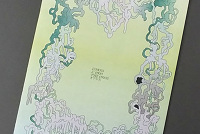
[Below is a detail from the symbol text]
The top text in black is a series of shapes that seem to match one-for-one the series of lettering in the bottom red material that is in English. I have not checked all the text, but it seems from a quick inspection that the symbols follow a standard equivalence, which might be the following.
I am not entirely sure what the purpose is for duplicating the text in these shape-symbols. The only difference I have noticed is that at the end of the shape-symbol part the editor gives his initials in symbol, while in the English part he does not. Also, I did not find in the symbol section the English part's footnoted image credits. The shape-symbol section is also where most of the images are placed. In the rest of the text, Arabic numerals are not used on each page to indicate which one it is in the sequence. Instead, the shape-symbols stand in for each page's number. So one must keep in mind the equivalences to know which page is which. However the cartoonist's name and the work's title are given in Latin letters on each page.
Later in 1937, we see a sequential work by Wassily Kandinsky, Thirty, where the painting is broken into 30 panels, although there seems to be "no clear sequence" (iv).
In Jackson Pollock's Red Painting 1-7, circa 1950, "the relationship between the paintings seems to go beyond the more accepted notion of seriality (where the number of related pieces play variations on one pictorial theme) and toward a gradual transformation of form from image to | image that is not so different from what Kranz had achieved in his earlier picture series" (iv-v).
In his Black and White (San Francisco) (1960), Willem de Kooning "not only constructs a formal dynamism that carries us sequentially through the piece, but also fashions a simple narrative arc by differentiating the last panel, with its near-verticals, from the energetic diagonals of the first three drawings, thereby suggesting a kind of abstract punchline to his four-panel 'strip' " (v).
Pierre Alechinsky
Molotiu continues "many of the most aesthetically satisfying comics can also be seen as, deep down, abstract comics, if one only looks at them in the right way. Besides gathering the best of the genre of abstract sequential art - or, rather, in the very act of doing so - this book attempts to cast the light that will enable such a look" (ix).
Brief summary:
Abstract comics are ones that either 1) have no narrative cohesion even though they have representational imagery, or 2) have no representational imagery, although they might have certain intensive narrative elements, like rhythm, rise and fall development, pacing, and so on. In sequential visual arts generally speaking early attempts at "abstract comics" can be found as early as the 1920s. In the comics medium taken more exclusively, the earliest abstract works were made in the 1950s. However, by studying the dynamics of shape and form in such abstract works as the comics featured in this collection, we may come to appreciate the abstract visual elements even in more conventional comics genres from all periods of comics history.
Summary
In Molotiu's introduction, the pages are divided in half, top from bottom. Here for example is the first page:

[Below is a detail from the symbol text]

The top text in black is a series of shapes that seem to match one-for-one the series of lettering in the bottom red material that is in English. I have not checked all the text, but it seems from a quick inspection that the symbols follow a standard equivalence, which might be the following.

I am not entirely sure what the purpose is for duplicating the text in these shape-symbols. The only difference I have noticed is that at the end of the shape-symbol part the editor gives his initials in symbol, while in the English part he does not. Also, I did not find in the symbol section the English part's footnoted image credits. The shape-symbol section is also where most of the images are placed. In the rest of the text, Arabic numerals are not used on each page to indicate which one it is in the sequence. Instead, the shape-symbols stand in for each page's number. So one must keep in mind the equivalences to know which page is which. However the cartoonist's name and the work's title are given in Latin letters on each page.
So what might be the reason Molotiu chose to have this shape-symbolic text element, when it does not seem to add any information to the presented material? Perhaps it is simply to thematize and decorate the text with foreign symbols, which would remind the reader that we are dealing with abstraction. Perhaps it is also there to give the reader the mental experience of not understanding something but instead just seeing shapes, as preparation for the abstract comics, which will not be "meaningful" in the normal narrative sense. Or perhaps it replicates the process of deciphering that one may make use of while reading the comics.
In the table of contents, the introduction is listed as beginning on page 0, were we to follow the shape-symbol equivalences. I will cite the page numbers using lower-case Roman numerals.
"Introduction"
Molotiu begins by noting that the meaning of "abstract comics" is not self-evident, since we might think that all comics must tell stories and thus cannot be abstract.
He says that abstract comics include two types: works of sequential visual art that 1) contain only abstract imagery, or that 2) include representational imagery but lack narrative cohesion. [I am not sure if we would include works with abstract imagery that also tell a coherent narrative, but without text. For example, a "love story" that we might discern just from the interactions of two bare shapes.]
Of course, abstract comics can be defined as sequential art consisting of abstract imagery, and indeed most of the pieces in this volume fit that definition squarely. But the definition should be expanded somewhat, to include those comics that contain some representational elements, as long as those elements do not cohere into a narrative or even into a unified narrative space; such a definition closely parallels that of "abstract film," and also has the great virtue of allowing us to file in the category R. Crumb's "Abstract Expressionist Ultra Super Modernist Comics" from 1967 (published in Zap no.1, and the first piece in this anthology) [...].
What does not fit under this definition are comics that tell straightforward stories in captions and speech balloons while abstracting their imagery either into vaguely human shapes, or even into triangles and squares. In such cases, the images are not different in kind, but only in degree, from the cartoony simplification of, say Carl Barks' ducks. Thus, the use of "abstract" here is specific to the medium of comics, and only partly overlaps with the way it is used in other fine arts. While in painting the term applies to the lack of represented objects in favor of an emphasis on form, we can say that in comics it additionally applies to the lack of a narrative excuse to string panels together, in favor of an increased emphasis on the formal elements of comics that, even in the absence of a (verbal) story, can create a feeling of sequential drive, the sheer rhythm of narrative or the rise and fall of a story arc. As this book attempts to be the first to chronicle, over the better part of the last century and with increasing frequency in recent years, cartoonists and other artists have played with the possibility of sequential art whose panels contain little to no representational imagery, or that tells no stories other than those resulting from the transformation and interaction of shapes across a comic page.
(0/i)
[[These comics will not have story but will still have "the feeling of sequential drive, the sheer rhythm of narrative or the rise and fall of a story arc". As such, perhaps we might say that certain intensive elements remain and are perhaps accentuated.]]
Although abstract comics do not have a "proper tradition", we may still note that "within the world of comics and cartooning, abstract images have been laid in sequence since at least the late 1950s" (ii). But there were similar experiments "in the wider world of art dating back to the 1920s". The idea for abstract comics "seems to have arisen, apparently independently, on numerous occasions, in the work of early non-representational artists, Pop-Art painters, underground cartoonists and many others" (ii).
This book collects various efforts at creating abstract comics: "it surveys what has been done so far, and suggests myriad possibilities as to what might happen next" (ii). It include works by those associated with the underground movements, with "newave" comics, with more mainstream works, with the Swiss/French school of abstract comics, and with other genres of cartooning.
Between them, the artists investigate how every aspect of the mechanism of comics can be exploited and made the vehicle for sequential development - from the panel-to-panel play of abstract shapes that creates potent formal dramas (such as in the pieces by Lewis Trondheim or Andy Bleck), to the sequential potential of color (in pieces by Grant Thomas or Mark Gonyea), panel rhythm and page layout (for example in the contributions of Warren Craghead and Henrik Rehr), page-to-page rhythm (Jason Overby and Alexey Sokolin), and so on.
(iii)
"A Brief Prehistory of Abstract Comics"
The first strip in this anthology is from 1967. But there are many developments in abstract sequential art that came before. One example is "Russian Suprematist El Lissitsky's 'children's book,' About Two Squares [figure 1], created in 1920 and published | in 1922, featured the brief tale of a black and a red square that arrive in a chaotic world and restructure it into a new order" (iii-iv).

Moloniu continues,
While openly an allegory of the Russian revolution, and also disqualified from our definition of "abstract comics" by the captions underneath each image, El Lissitzky's book nevertheless presented in the six pages of its story a graphic drama whose narrative arc, notwithstanding its allegorical aspects, relied on primarily formal transformations - specifically, from disorder to clarity and harmony.(iv)
Moloniu then notes the Bauhaus student Kurt Kranz " 'picture sequences,' the most important of which may be the color '20 Phases in the Life of a Composition,' of 1927-28, and 'Picture Sequence, Black: White,' of 1928-29" (iv). The 'Picture Sequence' work "consisting of 40 black and white drawings in which geometric shapes slowly accumulate, grow, and metamorphose, may be considered the earliest masterpiece of abstract sequential art" (iv).

Later in 1937, we see a sequential work by Wassily Kandinsky, Thirty, where the painting is broken into 30 panels, although there seems to be "no clear sequence" (iv).

In Jackson Pollock's Red Painting 1-7, circa 1950, "the relationship between the paintings seems to go beyond the more accepted notion of seriality (where the number of related pieces play variations on one pictorial theme) and toward a gradual transformation of form from image to | image that is not so different from what Kranz had achieved in his earlier picture series" (iv-v).

In his Black and White (San Francisco) (1960), Willem de Kooning "not only constructs a formal dynamism that carries us sequentially through the piece, but also fashions a simple narrative arc by differentiating the last panel, with its near-verticals, from the energetic diagonals of the first three drawings, thereby suggesting a kind of abstract punchline to his four-panel 'strip' " (v).

Molotui continues:
If de Kooning's piece only evokes the formal mechanism of a comic, the artists connected to the Pop movement addressed popular culture more directly. While Roy Lichtenstein's well-known transformations of comic-book imagery dismantled comic sequentiality by isolating individual panels and blowing them up into stand-alone paintings, Jasper Johns took the opposite tack in an early piece, doing away with recognizable figuration but still maintaining the the impression of sequence. In his painting Alley Oop of 1958 [...], he glued a Sunday Alley Oop newspaper strip to a canvass and painted it over, eliminating representational details and maintaining only larger areas of color which still suggest the shapes of word balloons or characters. The result is a visual impression of a comic strip, as seen perhaps from a distance or when squinting. Yet, perhaps due to our familiarity with the Sunday pages, the piece still reads, though we are only able to perceive the main dynamics of the images without recognizing any of their figurative content.
(v)

Saul Steinberg in 1958 "drew a number of abstract four-panel strips which he later combined on one page of his 1960 book, The Labyrinth, to suggest a wild burlesque of a newspaper comics page. In these strips [...], where figuration is mostly absent, the ineluctable rhythm of a four-panel humor strip nevertheless remains, marked by contrasting graphic events and almost always ending with an explosion for a punchline - a humorous equivalent of de Kooning's last panel" (v).

Pierre Alechinsky
brought the graphic and painterly energy of American Abstract Expressionism together with a more European new figurality. In 1965 Alechinsky began subdividing the surface of his images, arranging abstract and near-abstract shapes in patterns clearly derived from sequential art (both from comics - which he readily acknowledges as an important source - and from medieval and Renaissance narrative painting series). In much of his work this subdivision has remained marginal, usually to be found along his paintings' borders or predellas; however, in several drawings made in 1977 [...], the arrangements of panels clearly imitated the layouts of bande dessinée pages, suggesting mysterious narratives that could only be guessed by the reader.
(vii)

There were also developments in abstract comics in works of visual poetry. George Smith and Cristina Filicia dos Santos "arranged geometric shapes and what we might call, paradoxically, 'abstract ideograms' in patterns closely reminiscent of comic layouts, initiating yet another possibility for how abstract sequential art might be approached" (vi).

Even in comics themselves, although through most of their history their
connection to popular culture negated the possibility of overt experimentation with abstract forms, abstract play and the sequencing of | formal events often snuck in, whether consciously intended by the artists or not. [...] In Winsor McCay's Little Nemo in Slumberland of March 1, 1908 [...], Nemo and his companions are subjected to the counter-clockwise turning of the colonnaded hall that they are trying to traverse. the page establishes a strong graphic rhythm as the hall's vaulted ceiling appears as a blue wedge marking, as it were, from panel to panel an in reverse order, the times from 9 to noon. The contrasting brown-yellow-and-green columns undergo a movement already familiar to us from de Kooning's piece: beginning from a provisional state of balance in the first panel - a horizontality that may appear as visually stable, but that is countered both by the panel's asymmetry and by our commonsensical knowledge of how buildings are supposed to stand - they cycle through five more unbalanced states until they come to rest, vertically, symmetrically, and in accordance with the laws of architecture, in the last panel (last except for the usual small inset of Nemo waking up, that is), the wider size of which also marks a clear ending to the strip. While this graphic sequence is, of course, tightly enmeshed with the characters' own reactions to the fantastical goings on, it is in no way masked by them, and is indeed the first thing to be registered by the viewer's gaze when approaching the page, even before beginning to read it.(viii)

Steve Ditko's Dr. Strange often journey's through bizarre regions. In panels from Strange Tales 133 (June 1965) we see that "Ditko's compositions, like McCay's, are structured in ways that evoke arcs of formal transformations, such as the first tier's move, across three panels, from a left-to-right diagonal main axis, to a vertical, centered one, and finally to the opposite diagonal" (viii).

With this in mind, we might look even at conventional super-hero comics and see a play of abstract shapes: "abstract comics reveal something fundamental about the comics medium itself. Reduced to the medium's most basic elements - the panel grid, brushstrokes or penstrokes, and sometimes color - they highlight the formal mechanisms that underlie all comics, such as the graphic dynamism that leads the eye (and the mind) from panel to panel, or the aesthetically rich interplay between sequentiality and page layout" (ix). Thus we may look at this other page by Ditko in a new light.

Molotiu continues "many of the most aesthetically satisfying comics can also be seen as, deep down, abstract comics, if one only looks at them in the right way. Besides gathering the best of the genre of abstract sequential art - or, rather, in the very act of doing so - this book attempts to cast the light that will enable such a look" (ix).
Molotiu, Andrei (Ed.). Abstract Comics. The Anthology: 1967-2009. Seattle, Wash.: Fantagraphics, 2009.
No comments:
Post a Comment