by Corry Shores
[Search Blog Here. Index tabs are found at the bottom of the left column.]
[Central Entry Director]
[Literature, Drama, and Poetry, Entry Directory]
[Graphic Literature, Entry Directory]
[Thierry Groensteen, Entry Directory]
[Groensteen’s The System of Comics, entry directory]
[The following is summary. My own comments are in brackets. Boldface is mine.]
Chapter 1:
The Spatio-Topical System
1.4
On the Importance of the Margin
Brief summary:
The margin on the comics page is not merely extra space surrounding the more valuable visual material in the center. The margin in fact can affect the way we perceive, read, and understand the other imagery. The margins for example can be filled with other art that interacts with the central images or it may be colored, which gives it a presence of its own and a visual relation to the panels.
Summary
Recall that the hyperframe is the visible or implied boundary enclosing all the panels on the page. The margin, then, is the space on the page lying outside the hyperframe’s boundary’s.
However, the margin can also be understood as crossing the hyperframe’s boundaries and occupying the spaces between panels.
As we have defined it, the hyperframe separates the useable surface of the page from its peripheral zone, or margin. (This definition accords with the usual meaning of the word frame, since the first function of a frame is always to detach a form from its base.) To the degree that it infers a cohesion between the different panels that comprise it, there is a corollary that is the assimilation of the margin as the only circumference of the page. Some emphasize that this is a reductive definition of the margin, which pushes its benefits to the interior of the page. Indeed, the empty interstices that separate the panels can actually be perceived as reticular extensions of the margin. From the hollow quadrilateral that it was, these are transformed into a labyrinth. This interpretation is notably supported by Antonio Altarriba.12 The margin, according to Altarriba’s definition, is nothing more than the base upon which the multiframe breaks away like a form in archipelago. In this usage, the term margin becomes synonymous with “the part not recovered by the base.” [ft.12 “12. “The margin frames the drawing in a page and infiltrates the same, overcoming its white space between panel and panel.” Paper at the Colloque de Montpellier on La marge dans la bande dessinée, June 1986. The manuscript was provided to me by the author; I do not believe that it has been published.” (169)]
(31)
Groensteen further claims that the width of the margin can change how we appreciate a comics page, and he cites some instances where the re-edition changed the margin sizes. [His next point seems to be that just how the spaces between panels frame the material within the panels, so too do the margins frame all the material on the page. These framing margins create a division in how we treat the material. We come to section-off the visual space of the comics page from the rest of the visible world surrounding it. This perhaps could be why looking at a comics page is like peering through a portal into another world.]
Just as the interpanel blank spaces redouble the frame of each of these | panels, similarly the margin acts as a supplemental frame with respect to the exterior outline of the hyperframe (an outline partially virtual in the sense that, as we have already noted, it generally includes interruptions). Now — I will return to this point — the frame of an artwork participates fully in its enunciative apparatus and in the conditions of its visual reception. In autonomizing the work, in the isolation of the exterior reality, it accomplishes its closure and constitutes it as an object of contemplation; in the case of comics, an object of reading.
(31-32)
Margins are not always merely blank spaces that receive no further role in the reading. They can be adorned with text and other imagery that is vital to the page’s overall presentation.
It must also be noted that the margin is not necessarily virginal. It frequently welcomes a title, a signature, a page number, inscriptions in which the structuring effect is not negligible. Most of Franquin’s Idées noires are bordered, in the upper margin, by a word game by Yvan Delporte, and in the lower margin, by the artist’s signature, in which one finds a propensity to reproduce, in miniature, the principal theme of the page (cf. Idées noires, Audie, “Les albums Fluide Glacial” 1981).
(32)
Margins have been filled in many similar ways.
It is easy to imagine ways to populate the margin, including through drawings, as was formerly seen in the famous Hauts de page by Yann and Conrad, published in the weekly magazine Spirou beginning in 1981, and the no less famous gags by Sergio Aragonès in the pages of the monthly Mad magazine. For those who recall them, these few examples suffice to demonstrate the diversity of relations that marginal animation can maintain with the page itself: this relation was indifferent for Aragonès (the gags had no necessary connection to the page that they accompanied) was of a slightly higher order in Franquin, and was aggressive or parodic in Yann and Conrad.
(32)
[Below we see how Aragonès’ marginal drawing in the bottom right corner is not related to the story in the panels.]
[However, the Yann and Conrad marginal drawing at the top is like a parody of the content in the panels below it.]
Groensteen’s next point is that margins need not just be white. They can be colored as well. He points to an interesting case where the margins are colored yellowish brown, but the hyperframe is blackened along with all the spaces between the panels.
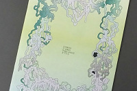
A book such as Rebelle by Pierre-Yves Gabrion interests my subject all the more since it combines two seldom seen principles. [...] On the one hand, the panels are separated by black spans, and the entire page takes part in a hyperframe of the same color and noticeably of the same thickness; on the other hand, the margins are, themselves, printed in a yellowish-brown shade. In this apparatus, it can be seen that the black reinforces the cohesion of the page, and that the yellowish-brown, in its difference, confirms the margin as a frame; but the major gain is no doubt to add white to the palette of the colorist as a color in its own right. The white, indeed, ceases to appear as the natural color of the published book (the paper on | which the book is printed), once again becoming a color like the others, likely to combine with them within the panels.
(32-33)
[Below the margin is shown a bit thin. I artificially placed a white margin around the page’s original yellow margin, to set it off from the yellow blog background. Try clicking it and enlarging on photobucket to see it better.]
So as we can see, the margins can influence the way we read, understand, and perceive the page’s visual contents. Groensteen says margins have this influence through its varying parameters: 1) its size, 2) its contents, and 3) its autonomy.
Thus, the margin can, in playing within diverse parameters, inform the contents of the page and inflect its perception. These parameters are: its width, the | drawings and the inscriptions that it hosts, its color, and, finally, its degree of autonomy, which depends on two binary factors, the closure or the aperture of the hyperframe (continual outline/intermittent outline) on the one hand, and, on the other, as one has seen, the identity or the chromatic difference between the margin and the interpanel interstices.
(33-34)
From:
Thierry Groensteen. The System of Comics. Translated from French to English by Bart Beaty and Nick Nguyen. Jackson, Mississippi: University Press of Mississippi, 2007. Originally published as Systém de la bande desinée. Paris: Presses Universitaires de France, 1999.
Images from:
Will Eisner. The Dreamer. New York: DC Comics, 1985.
Pierre-Yves Gabrion. L'Homme de Java. Ëditions Vents d'Ouest, 1990.
André Franquin. Idées noires. Rombaldi, 1988.
MAD Magazine #108, Jan 1967. Showing Antonio Prohías, “Spy vs. Spy.” With marginal art by Sergio Aragonés.
Spirou #2253, Jan 1967. Showing Hermann Huppen, "Eh, nic! tu rêves?". With marginal art by Yann & Conrad (Yannnick Le Pennetier and Didier Conrad).
This entry’s url:
http://piratesandrevolutionaries.blogspot.com/2015/12/groensteen-14-system-of-comics-on.html


No comments:
Post a Comment