


by Corry Shores
[Search Blog Here. Index tabs are found at the bottom of the left column.]
[Central Entry Director]
[Literature, Drama, and Poetry, Entry Directory]
[Graphic Literature, Entry Directory]
[Thierry Groensteen, Entry Directory]
[Groensteen’s The System of Comics, entry directory]
[The following is summary. My own comments are in brackets. Boldface is mine.]
Chapter 1:
The Spatio-Topical System
1.6
The Composition and the Double Page
Brief summary:
When we read a comic book, we normally spread it open to make both left and right page sides visible. Comics creators can make use of the experiential properties of this set-up. They can bring the pages into a dialogue of sorts by relating the parts visually.
Summary
When we read a comic book or magazine, we see a double page spread. Groensteen will now discuss the ways this double spread is a factor in comics design and layout. “In principle, the part of the support (magazine or book), and the segment of the work, that is offered to the reader’s gaze is a double page. From the point of view of perception, the double page constitutes a pertinent unit and merits our attention at this time” (35).
We recall from section 1.2 the two cases of a door-way scene transition in Tintin. We noticed that when the transition occurs as we turn the page, there is more suspense than if the transition is visible already on one page. It would likewise make a difference if the transition went from left-side page to right-side, since we might already have the next scene’s contents in our peripheral vision.
An author may make creative use the relation between the left and right side pages. (35)
When the story is told with just two pages, the authors may make greater use of the relation between left and right pages. We will look at an instance of inversion in Edmond Baudoin and of symmetry in Federico Del Barrio (35-36).
Boudoin’s work is “an adaptation of an extract from Kafka’s Journal” (36). The right-side page and the left-side page are a sort of symmetrical chiasmus.

The second reverses head to toe the structure of the first: the vertical | series of the first page (text + the larger strip + text the narrower strip) gives way to the second page, the inverse series (the narrower strip + text + the larger strip + text). The repetition of the image established by the flat of the hand assures the transition between the two pages, however the identity of the person who is reflected in the mirror and, correlatively, the position of the second person, | are inverted. It is the introduction of this mirror theme and the theme of reflection (absent from the original text) that not only allows but actually generates these diverse figures.
(36-38)
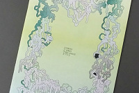
In Del Barrio’s “La Orilla,” the symmetry of the V form shapes the story of birth, life, and regeneration.

The two pages by Del Barrio, entitled La Orilla (“The Shore” [...]), summarize the life of a woman in six wordless images. The passage from the first to the second page corresponds grosso modo to the middle of this existence. The long diagonals that draw the successive positions of the people on the page respond symmetrically: the descending diagonal on the left hand page is “reflected” in the ascending diagonal of the right hand page, the pair tracing a figure V. One can note the reappearance (in a miniaturized form) of these two diagonals crossed in the footprints that are left on the sand by the aging heroine and her daughter.
(38)
Groensteen further finds significance in the orientation of the rectangle forms as well.
The directions of these two diagonals can seem paradoxical at first, in the sense that, in descending before re-ascending, they move backward from the phases of corporeal evolution over the course of a lifetime (the body grows at first, then, with coming age, shrinks), and those of existence itself, that of the rise toward maturity, followed by a decline. This apparent paradox probably has no end other than to allow the letter V to appear, the first letter in the word vida (life), which | redoubles and summarizes the theme of the work. But it is also somewhat canceled by the changing of the panel axes, of which it is possible to risk a symbolic reading. The three panels of the first page are horizontal. It is possible to see the idea that, in the first case, life is lived in the mode of contemplation (panel 2) or expenditure (panel 3), which appears inexhaustible. The horizontality is like infinity, like carelessness. But the axis reverses itself on the second page, which is made up of three vertical panels. From then on, the gaze encounters that which the young want to ignore. Moving forward is now going toward the end, and leaving behind imprints, which are also vestiges. If the end of life has a form, it is no longer that of an open territory, but that of a road offering nothing more than a single trajectory.
(38-39)
The left-side page can be called the “fausse page,” and the right-side one the “belle page.” Groensteen says that probably there are many more ways that these two page sides can be connected or opposed. For example, in
Le Bandard fou by Moebius (1974) or The Rail by Claude Renard and François Schuiten (1982), the actual comics pages occupy only the right hand pages, those of the left hand side are invested with “illustrated” pages where the succession creates a kind of sequential counterpoint. But this particularly bookish organization of material privileges distant relationships, in absentia (the linkages are always made between pages that are not simultaneously offered to the gaze), which I will speak of under the title of general arthrology.
(39)
[I am not familiar with arthrology, but it seems generally to be the anatomical study of joints, and in the case of comics, it perhaps studies the ways that parts of a comics work interact, perhaps especially parts that are not simultaneously visible.]
[In the first few pages of Moebius’ Le Bandard fou, we see how the left-side pages are depicting their own series of images forming a “sequential counter-point.”]

[Below I have made an animated gif of the left-side panels.]

[Below we see the page patterning of Claude Renard’s and François Schuiten’s Le Rail, from the first four pages. Below that again is an animated gif of the sequential images.]


Groensteen concludes by saying that we will think more about how we perceive the interacting spaces of the comics page and also more about the function of the panel and frame.
Yet, before progressing in the analysis of the diverse ways by which panels are articulated, it is still necessary to refine our perception of the constitutive spaces of the spatio-topical system and to detail the multiple functions that fill the panel and its frame.
(39)
From:
Thierry Groensteen. The System of Comics. Translated from French to English by Bart Beaty and Nick Nguyen. Jackson, Mississippi: University Press of Mississippi, 2007. Originally published as Systém de la bande desinée. Paris: Presses Universitaires de France, 1999.
Images from:
Edmond Baudoin. “Journal de Kafka.” In 9e Art #1, Jan 1996. Angoulême; Centre National de la Bande Dessinée et de L'Image.
Federico Del Barrio. “La Orilla.” From pp.34-35 of Madriz #13, Feb 1985. Madrid: Sombras.
Moebius. Le bandard fou. Paris: Humanoïdes associés, 1976.
Claude Renard and François Schuiten. Le Rail. 2nd edn. Paris: Les humanoides associes, 1984 [1st edn. 1982].
This entry’s url:
http://piratesandrevolutionaries.blogspot.com/2015/12/groensteen-16-system-of-comics_30.html
No comments:
Post a Comment