


by Corry Shores
[Search Blog Here. Index tabs are found at the bottom of the left column.]
[Central Entry Directory]
[Literature, Drama, and Poetry, Entry Directory]
[Graphic Literature, Entry Directory]
[Thierry Groensteen, Entry Directory]
[Groensteen, Comics and Narration, entry directory]
[The following is summary. Boldface and bracketed commentary are my own.]
Thierry Groensteen
Comics and Narration
Chapter 7:
The Rhythm of Comics
7.3
Three Types of Emphasis
[We previously discussed the “waffle-iron” grid layout of comics, with one example being Chester Brown’s Louis Riel. A Comic-Strip Biography. We displayed this panel as illustration:

] In the panel layout of Louis Riel, as we can see, there is a grid of six panels enframed by a fairly thick line. Groensteen says that the cadence can be experienced as stronger or weaker, depending on what is going on in a particular sequence of panels. He further states that there are two sorts of effects involved in these variations of cadence: {1} effects that arise out of repetition, and {2} effects that play on periodic alternation (144).
Groensteen begins with repetition. It results when the contents of a series of frames remains homogeneous in a some basic way such that it seems we have one scene seen from a static observer that is prolonged while we witness the activity taking place.
Repetition: this is the effect of the “static shot” of a character, a group, part of the decor (this borrowing from film vocabulary indicates that the whole scene is perceived from a single spatially determined point). I will also refer to this as a “seriality effect.” By repeating the same framing over and over again, the artist emphasizes a key moment within the narrative and prolongs it not on the mode of “and then” but rather of “and still . . . and still . . . .” On page 23, five panels offer a high-angled viewpoint over a stockade. A man is nailing a proclamation to the fence, and people are stopping to read it—first a single passer-by, then two more, then some others. On pages 70–72, the final seconds before the execution of Thomas Scott, found guilty of treason, are cruelly dragged out, as the question as to whether he should stand or kneel before the firing squad is posed | three times. The same framing is used eleven times before the white panel used by Chester Brown to render the actual moment when the condemned man is shot. Throughout the sequence, time seems to stand still, and the sight of Scott becomes more and more unbearable each time it is reiterated. The repetition creates a particular kind of dramatic tension—it is as if the reader can hear the reverberation of the drum that beats out, unflinchingly, these solemn and dreadful moments.28
(144-145)
[Footnote 28 from p.192: Similarly, in From Hell, the almost unbearable scene from chapter 10, which details every step of the murder committed by William Gull on November 9, 1888, and particularly pages 4 to 9, where the victim is savagely disfigured and ripped apart, draws its power from the regularity of the layout and the continuity of the angle of vision. It is noteworthy that From Hell makes frequent use of the static shot, which is not the case for Watchmen. Alan Moore and Eddie Campbell, From Hell (Marietta: Top Shelf Productions, 1999).]
[Below we see the first Louis Riel static shot scene.]


[Now below we see the second static shot scene from this graphic novel.]


[And now below are some of the pages from From Hell that Groensteen cites in the footnote.]


Repetition, as we saw, maintains a homogeneity across a series of consecutive panels, and this creates also a metricized temporal rhythm. The next sort of rhythmic variation is alternation. The contents might swing between visual poles, like light and dark.
Alternation: Brown makes skilful use of the three colors in his palette, black, white, and gray. The hierarchy of values can be overturned at any point. So black, heavily present in one scene, can disappear altogether in the next. These contrasts may emphasize the general structure of the narrative, its division into scenes, whose respective length is in itself a rhythmic element; they may also set consecutive panels on the same page against each other and create a checkerboard or stroboscopic effect.
(145)
[Below is another page from Louis Riel. In this case, we have starting with panel 2 an alternation of light and dark.]

Groensteen then says that there can be alternation also with “actual iconic content or the angle of vision” (145). He notes the trial scene at the end of Louis Riel where there is an alternation of figures all at the same profile perspective. “The rhythmic effect is very powerful, especially in the passages corresponding to the questioning of the witnesses, which have the pace of a verbal and visual ping-pong match” (145). [Below is a page from this trial scene.]

[Groensteen then mentions parenthetically the stroboscopic rhythm of Breccia’s adaptation of Poe’s Tell-Tale Heart.]
(There is a famous example of a comic that bases its narrative project on the repetition of a small number of images. This is the Alberto Breccia adaptation of Edgar Allan Poe’s short story, The Tell-Tale Heart.30 I have written elsewhere that “the stroboscopic effect” produced by Breccia proves to be a “remarkable graphic transposition of the heartbeats of the victim” that the murderer believes he can hear in his room.31 It is, of course, this auditory hallucination that induces him to confess his crime and to lead police to the body buried under the floorboards.)
(145)
[Footnote 30 on page 192: First published in French in Charlie mensuel, no. 88, (May 1976).]
{Footnote 31 on page 192: See my article: “Le cadavre tombé de rien ou la troisième qualité du scénariste” [The corpse that fell for no reason, or the scriptwriter’s third quality], Revue de l’Université de Bruxelles, nos. 1–2 (1986), Autour du scénario, pp. 111–18”.}
[Below are some pages from Breccia’s "El corazón delator."]


[I am not entirely sure what the next idea is, but it seems that you can have alternation of larger chunks, called periodic alternation. This is like a stanza in poetry, and you could have the equivalent as a group of panels on a comics page. It seems Groensteen indicates that we will deal more with this later when examining irregularity.]
Periodic alternation is one of the eight characteristics of rhythm enumerated by the Belgian philosopher and semiotician Henri Van Lier after an investigation of the properties of human walking. Another of his examples is “stanza formation,” or the combining of several elementary units (in this case, strides) into larger ones.32 The notion of the stanza, used in poetry to designate a section of | the poem made up of several lines, can easily be transposed to comic art. It designates a group made up of several panels that stand out in relation to the page, the sequence, or the book as being particularly salient, because the panels in question produce a seriality effect through the repetition or alternation of content or formal features. The panels in the same stanza echo each other and display one or other of these types of cohesion to a remarkable extent. The stanza is therefore a key component of rhythm, not only in the case of the “waffle-iron” but also, if not more, as we shall soon see, in irregular layouts.
(145-146)
{Footnote 32 on page 192: See Henri Van Lier, Anthropogénie [Anthropogenics], Brussels: Les Impressions nouvelles, 2010) pp. 18–21. (Translator’s note: Van Lier’s original term is “strophisme.”) The other characteristics of rhythm noted by the author are: interstability, accentuation (which I will include in my own analysis below), tempo, autoengendering, suspense, convection, and distribution through nodes, envelopes, resonances, and interfaces.}
So the first two types of rhythmic effects made possible by the waffle-iron grid are repetition and alternation. The third sort of effect is progressivity, of which there are two sub-types. {1} cinematic progressivity, which is “the cinematic decomposition of the action represented,” and {2} optical progressivity, that is, “the equivalent of the zoom in or out, which gradually brings us closer to or further away form a given subject” (146).
[Cinematic progressivity seems to be like holding the camera in one place while action continues in front of it, and so with regard to comics, it is a series of frames with a homogeneous visual perspective displaying a series of moments in an event.]
Cinematic progressivity usually goes hand in hand with the insistent repetition of the same framing. Historically, it emerges out of the chronophotographic experiments of Muybridge into the breaking down of movement, as Thierry Smolderen has demonstrated.33 It was with the artist Arthur B. Frost, an ardent admirer of Muybridge, that comics became interested in movement, arising out of its specificity as an art form composed of intervals. Smolderen shows how Frost’s “chronophotographic waffle-iron grid” rapidly became adopted as standard in the Sunday newspaper comics.
(146)
[Footnote 33 from p.192: Naissances de la bande dessinée, op. cit., pp. 104–17.]
[I do not have access yet to Smolderen’s book to know exactly which Frost images he is referring to. But here is a possible example. We see the decomposition of the action, as if a camera is rolling and we are taking out selected frames.]


Groensteen then says that the progressivity effect is found in Cliff Sterrett’s Polly and her Pals. But I was only able to find one example.]
One of the cartoonists who exploited it to most spectacular effect was certainly Cliff Sterrett.34 Among the Polly and her Pals Sunday strips, there are remarkable examples of “static shots” (for example, the pages from August 8, 1926, and July 13, 1930, which both have an underwater setting and frame only the legs of the characters), and others, just as striking, of the cinematic decomposition of an action (we can cite the occasions when Samuel Perkins falls into the water on August 25, 1926, and August 24, 1927, collides with a passing woman during a storm [March 3, 1929], or attempts to close and secure a trunk [July 21, 1929]). Sometimes the two effects come together, as on the page which sees the same Sam trying to swallow a pill with the help of water from a fountain (January 16, 1927).
(146)
[Footnote 34 on p.192: The work of Frost and Sterrett was published in France in the twenty-first century by the L’An 2 publishing house.]
[Below is the one from August 8, 1926.]

Groensteen then notes that he will return to the rhythm of silent/wordless comics later.
The structure of the waffle-iron grid is apparent upon the first glance of the page, and three effects we discussed can operate on the level of the page as a whole (147).
Along with Polly, there were many other cases of repetition in 20th century comics (147).
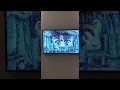
There are some variations in the waffle-iron grid structure. Watchmen and From Hell for example at times double or triple the panels by combining their sizes. Groensteen’s point is that these exceptional moments have even more pronounced rhythmic effects, given the consistent context they stand out starkly from. Thus the six consecutive splash pages of Watchmen have the effect of being like six gongs of a clock, as if at that moment time stands still.
Among comic books that conform to a regular layout, some observe the rule strictly (this is the case of Louis Riel, a work of deliberate austerity), while others are more flexible in their adherence to it. In Watchmen and From Hell, famously, the nine-panel grid works on a modular system, with some images double or triple the size of a standard panel.35 Although any infringement of the regular pattern is significant, it is obvious that the more it departs from the norm, the more it will stand out. In this respect, the first six pages of the twelfth and last chapter of Watchmen, the only splash pages of the whole work, have a remarkable impact. The rhythm of the narration freezes, and time is suspended over these images of devastation, an effect underlined by the title of the film being shown at the Utopia Cinema: The Day the Earth Stood Still.36 Douglas Wolk has made the valid comment that the reader perceives these six outsize images like “six consecutive unexpected gongs of a clock.”37
(147)
[Footnote 36 on page 192: A famous 1951 film by Robert Wise.]
[Footnote 37 on pages 192-193: See Douglas Wolk, Reading Comics (Cambridge, Ma: Da Capo Press, 2007), p. 239. Other critics have noted that this point about Watchmen also applies to the rest of Alan | Moore’s work: images taking up a whole page almost always coincide with some kind of apocalypse.]
[Here is one of the splash pages mentioned in Watchmen.]

[Here is a page with double and tripled panels, again from Watchmen.] 
[And here is a page from From Hell with a doubled panel.]


Groensteen also notes how Ferri and Larcenet’s Le Retour à la terre and Diago Aranega’s Victor Lalouz used standard six panel formats.
[Below is a strip from Ferri and Larcenet’s Le Retour à la terre.]

[And below is one of Diago Aranega’s Victor Lalouz.]

Groensteen notes that Schulz made use of the metrical rhythm of these homogenized panel patterns, and in fact he even repeated much in the content, “so to accentuate the slightest variations in posture or facial expression, and confers on them the status of graphic events that are information- and often emotion- bearing” (147-148, quoting his paper “Le système Schulz” [The Schulz System], Les Cahiers de la bande dessinée, no. 81 (June 1988), pp. 88–113; 91.)
Works Cited:
Thierry Groensteen. Comics and Narration. Translated by Ann Miller. Jackson, Mississippi: University Press of Mississippi, 2013. Originally published as Système de la bande dessinée 2. Paris: Presses Universitaires de France, 2011.
Image credits:
Chester Brown. Louis Riel. A Comic-Strip Biography. Copyright 2006 Chester Brown. Drawn & Quarterly.
Alan Moore (Writer), Eddie Cambpell (Artist), and Pete Mullins (Contributing Artist). From Hell. Copyright 2006 [1989] Alan Moore and Eddie Campbell. Top Shelf Productions.
Alberto Breccia. "El corazón delator." Obtained gratefully from SAP Comics.
http://sapcomics.blogspot.com.tr/2011/09/el-corazon-delator-tell-tale-heart.html
Arthur B. Frost. "A Tale of Two Tales." In The Bull Calf and Other Tales, pp.108-112. New York: Charles Scribners' Sons, 1892. http://archive.org/details/bullcalrtal00fros
Cliff Sterrett. Polly and Her Pals. 8-August-1926. Obtained gratefully from: RyallTime Blog. https://ryalltime.wordpress.com/2010/12/09/polly-and-her-pals/
Alan Moore (Writer), Dave Gibbons (Illustrator/Letterer), & John Mullins (Colorist). Watchmen #12. December 1986. Copyright DC Comics, 1986.
Charles Schultz. The Complete Peanuts: 1950-1952. Copyright 2004 United Feature Syndicate, Inc. Fantagraphic Books.
Jean-Yves Ferri & Manu Larcenet. Brigitte Findakly, colorist. Le retour à la terre. 1. La vraie vie. Poisson Pilote, 2002.
Diego Aranega. Victor Lalouz. 1. En route pour la gloire. Dargaud (Poisson Pilote), 2006.
This post’s URL:
http://piratesandrevolutionaries.blogspot.com/2016/01/groensteen-73-comics-and-narration.html
No comments:
Post a Comment