by Corry Shores
[Search Blog Here. Index tabs are found at the bottom of the left column.]
[Central Entry Directory]
[Literature, Drama, and Poetry, Entry Directory]
[Graphic Literature, Entry Directory]
[Thierry Groensteen, Entry Directory]
[Groensteen, Comics and Narration, entry directory]
[The following is summary. Boldface and bracketed commentary are my own.]
Thierry Groensteen
Comics and Narration
Chapter 7:
The Rhythm of Comics
7.5
Accentuation and Polyrhythm
[We previously examined some instances of structural irregularities in comics panelizations, and we observed the rhythmic influences they have. For example, speeds of timing may accelerate or decelerate, or syncopations or metrical cadences may suddenly and temporarily appear.] The previous examples we examined demonstrated how rhythm can be accentuated. Because these cases presented anomalous instances of structural regularity within a context of irregularity, “differentiation and accentuation are synonymous” in these instances (151). [So in other words, when the structure is irregular, rhythmic accentuation for the most part comes from local differences. As such, they perhaps lend themselves more to intensive differences like instantaneous variations in speed or amplitude of the beat. However, when the panel structure is regularized, more than just local variations can be implemented, since larger structural organizations can be developed. It seems perhaps Groensteen with his examples is saying that when you have structural regularities, you can establish a context or environment on the basis of which you can “code” or “program in” other variables with rhythmic effects.]
The localized occurrences noted above are specific examples of the accentuation of rhythm (in this context, differentiation and accentuation are synonymous). There now emerges a general rule, which is as follows. In the case of a comic with the smoothest possible beat (regular layout, reiteration of very similar iconic content, standard distribution of balloons over the page), many resources are available for accentuation, whether at the level of the stanza or at that of a single panel. Some of these resources come under the heading of the spatio-topical system, and have, for that reason, been signaled in System 1: a panel can be accentuated by its siting (especially when it occupies the central or the final position), by its shape or by its size. Others concern the content represented. These are: a break in the scale of images, in the continuity of a phased process (cinematic or optical progressivity), or in the chromatic range (through contrast in color). The final parameter that can be brought into play is, as we have seen, the amount of information offered to the reader, and, notably, the amount of text. These different kinds of accentuation can be used at the same time. The more of them the author brings together to make an image or a stanza stand out, the more remarkable the cumulative effect of scansion will be.
(153)
In my essay on La Cage [The Cage] written in 2002, I referred to the superimposition of a number of structuring rhythmic procedures in Martin Vaughn James’s famous experimental “visual novel”:
Like any published work that is inherently visual, La Cage consists of a sequence of double pages that are immediately perceived as a succession of diptychs. To this basic binary beat are added, in this instance, all kinds of rhythmic and even melodic effects. The reader only has to leaf through the book to make them visible: there are sequences which, like musical phrases, are sustained over several diptychs and are then suddenly broken off as another tune comes in; effects of rhyme, repetition, always with [. . .] some variation; alternation between large images split into two halves set out on facing pages and diptychs that juxtapose unrelated, self-sufficient images; and, finally, variations in the framing of the image that affect two of its parameters: size and position on the page. All these procedures, working together, stamp a particular rhythm onto Vaughn James’s visual novel, a rhythm made up of accelerations and pauses, moments of intensity and glissandos. The text intervenes on two levels. Considered in its simple physical materiality, it is, variously, absent altogether, reduced to a single line or expanded into a block of type, and may be positioned above or below the image. Considered as reading matter, it holds the attention for longer or shorter periods.44
{Footnote 44 from page 193: “La Construction de La Cage” [The Construction of La Cage], afterword to Martin Vaughn-James, La Cage (Brussels: Les Impressions nouvelles, new edition 2010) p. XLVI.}
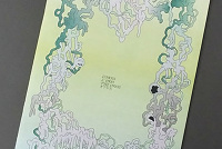
[Below is an image that illustrates partially some of these ideas. I obtained it very gratefully from Emmanuel Espinasse's Pinterest page.]
Groensteen cites other examples of polyrhythm from Alan Moore’s, Dave Gibbons’, and John Higgins’ Watchmen. On some pages, there are three layers of rhythm simultaneously at work. This results from an interchange between different scenes, which is like parallel editing in film. {1} There is the grouping of threes of each horizontal strip on the page. {2} There is the interchanging swing between both scenes. And {3} there is the constant repetition of text in each panel, that is not entirely homogeneous, since in one scene it is narration boxing and in another speech ballooning, and also in each box there will be different amounts of text.
The interweaving of different rhythms is also in evidence on certain remarkable pages of Watchmen, characterized by the alternation of two narrative sequences that intersect within the waffle-iron grid, overlaying onto the page an X-shape, which is reinforced by the distinctions in color tone between the two sequences in question.45 Moore’s skill lies in not disrupting the continuity of the text—the same dialogue goes on throughout the entire page, sometimes “on” (the speakers are shown: we will call this scene A) and sometimes “off” (the “image track” is uncoupled from the “soundtrack” and we see another scene in another place: scene B). The result is that on top of the cadence set up by the waffle-iron grid, the A-B-A/B-A-B/A-B-A structure actually interweaves several different rhythms: the ternary rhythm of the strip, the binary rhythm of the A-B alternation, and the rhythm of the text, at once regular in that it sits atop two series of images with no interruption—and irregular, in view of the varying length of the lines of dialogue.
(154)
[Footnote 45 from page 193: See, for example, the second, third, and fourth pages of Chapter 1, the first pages of Chapter 2, or pages 9 and 10 of Chapter 3.]
[Below is an instance where the pattern is obvious, but the panels of the bottom strip are combined.]
[Below are two consecutive pages where the grid remains intact.]
[Perhaps the pattern is more apparent when we place them side-by-side.]
[Below is the ternary rhythm of the three-paneled strips.]
[All while these triplets have their rhythmic effect, at the same time we experience the binary interchanging movement between scenes.]
[And still at the same time there is the constant beat of the text insertions, marking each panel with another tick.]
The discontinuity that is the basis of the language of comics ensures that rhythm is a central element of its discursive resources. It has been important to establish the following points here: that the rhythm peculiar to each work is enriched by multiple effects and strategies, that this rhythm is unceasingly | modulated throughout the work as a function of multiple parameters, that almost all the great authors are past masters at interweaving rhythms (emphatic and muted), and, finally, that readers have a role to play in the actualization of these combined processes—it is they who must interpret the score.
(155)
In fact, Chris Ware is the one who made this analogy of the reader interpreting the comic as if it were like a music score. Groensteen then notes the very slow pacing we often find in Ware’s work. It in a sense is a sort of anti-rhythm, since it seems to slow time down.
The latter expression originates from Chris Ware (“When you read a comic strip, it’s like reading a musical score. It’s up to us as readers to bring the music from the score alive”);46 and if there is one artist who has established , if not rhythm, then at least duration, as one of the essential dimensions of his own poetic art, it is without doubt the author of Jimmy Corrigan, whom we meet again here. When his work first began to attract attention, readers were all struck by his management of time, characterized by the stretching out of certain sequences, sometimes to an almost unbearable extent, further exacerbated by the nature of the sequences in question, which were marked by the immobility and indecisiveness of their protagonists, by non-communication and aphasia. As Jacques Samson writes, in Ware’s work, “time moves sluggishly, and displays its sluggishness.”47[Footnote 46 on page 193: Unpublished comment, during round table with author.]
[Footnote 47 on page 193: Jacques Samson et Benoît Peeters, Chris Ware, la bande dessinée réinventée [Chris Ware, Comic Art Reinvented] (Brussels, Les Impressions nouvelles, 2010), p. 150. See also Georgiana Banita, “Chris Ware and the Pursuit of Slowness,” David M. Ball and Martha B. Kuhlman (eds), The Comics of Chris Ware (Jackson, U P of Mississippi, 2010) pp. 177–90.]
[Below is a panel from a Jimmy Corrigan issue of Acme Novelty Library. As you can see, Ware is a genius.]
Groensteen explains that there is an anti-rhythmic element in Ware’s design, because much in the imagery is made to be experienced as if things were stagnating. Nonetheless, there are still rhythms in the way we experience the distended temporality of the events, and they can be modulated by such factors as panel sizes and their sequentialized contents.
The visual translation of the miring of the action—which amounts to an antirhythm— is achieved by a constant recourse to seriality effects: avoiding shotcounter shot sequences and pointless changes in framing, Ware cultivates instead the systematic, reiterating the same angles of vision over and over again. To which is added a very personal conception of layout, analyzed above (p. 49) as “a combination of quadrangular blocks.” In fact, the eye perceives at first glance that these blocks are not all equivalent: one large image means a pause, another series of small images represents the unfolding of a process, or is a figurative expression of emphasis. To the different formats configured by the artist there correspond different rhythms of apprehending the material, time spans mentally calculated by the reader. Ware likes to quote Goethe’s definition of architecture as “frozen music.” This metaphor applies perfectly to the architecture of his comics pages.
Thus even when time seems to stand still, there are yet other structural factors which give those pauses rhythm of a sort.
The question of rhythm is, nonetheless, all-pervasive in his work. It is transmitted, as we have seen, by the insistent repetition of certain iconic contents, but also by the mathematical principles on which the compartmentalizing of the space on the page is based. To the “nested regularities” that we have observed (the fact that the panels correspond to three or four standard formats, perfect multiples of each other), there correspond different beats, so that the page (and the narrative as a whole) is made up of interwoven rhythms—even when, within this rhythmic mechanism, the author manages to suspend the flow of time.
Works Cited:
Thierry Groensteen. Comics and Narration. Translated by Ann Miller. Jackson, Mississippi: University Press of Mississippi, 2013. Originally published as Système de la bande dessinée 2. Paris: Presses Universitaires de France, 2011.
Image credits:
Martin Vaughn-James. La Cage. Copyright Les Impression nouvelles. Obtained gratefully from Emmanuel Espinasse's Pinterest page:
https://www.pinterest.com/phenixdu16000/sp4ce-k0mix/
Alan Moore (Writer), Dave Gibbons (Illustrator/Letterer), & John Higgins (Colorist). Watchmen #1. September 1986. Copyright DC Comics, 1986.
Alan Moore (Writer), Dave Gibbons (Illustrator/Letterer), & John Higgins (Colorist). Watchmen #2. October 1986. Copyright DC Comics, 1986.
Chris Ware. Acme Novelty Library #14. Copyright 2000 Chris Ware. Fantagraphics Books.
This post’s URL:
http://piratesandrevolutionaries.blogspot.com/2016/01/groensteen-75-comics-and-narration.html


.jpeg)


No comments:
Post a Comment